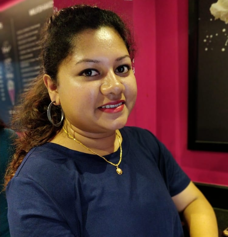
Hello, I am Kaveri Biswas

Web Developer at BBC News

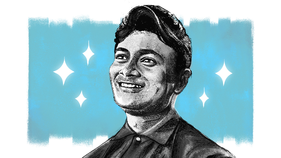
a picture of kaveri biswas smiling

Frontend developer and data storyteller with 6+ years of professional software development experience, specializing in 3+ years of interactive data journalism and visual storytelling. I translate complex datasets into award-winning, human-centered digital experiences using JavaScript, D3.js, HTML, CSS (SASS) and modern web technologies.

My work sits at the intersection of code, design, and journalism—collaborating closely with writers, editors, researchers, and designers to create interactive narratives that reach millions of viewers across 40 languages. I'm passionate about web accessibility, responsive design, and crafting experiences that make data meaningful, memorable, and accessible to diverse global audiences.

When I'm not coding, you'll find me playing violin, sketching, reading, or exploring the best eateries in Delhi.
Projects

Image shows a girl sitting with a cup of coffee where she is surrounded by various social media apps
My first byline: A data-driven longform feature exploring the growing loneliness epidemic in an increasingly connected world. I took full ownership of this project—conducting in-depth primary research interviews, analyzing public health datasets, creating interactive data visualizations, designing the visual narrative flow, and developing the immersive storytelling experience from concept to launch. Published across six Indian languages, this piece demonstrated how frontend development serves journalism, turning complex sociological research into an accessible, emotionally resonant digital story.
  • Reporting
  • Data Visualization
  • GSAP
  • Interactive Storytelling
  • Multilingual
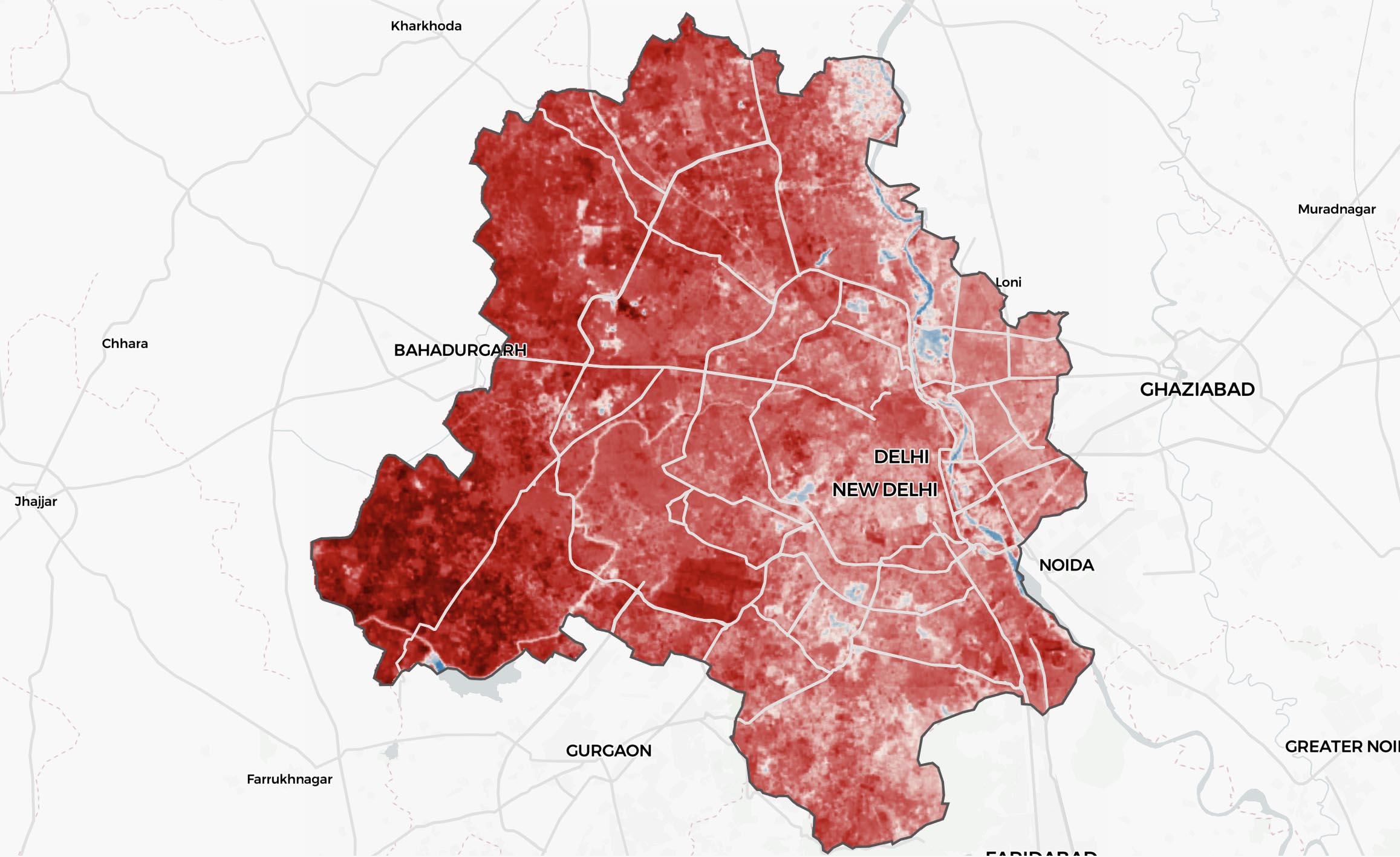
Image shows map of Delhi with pre-rendered raster tiles of surface temperature
Built an immersive interactive exploration of urban heat inequality across six Indian cities, combining interactive heatmaps (MapLibre with pre-rendered raster tiles, zoom levels 9–15) with Canvas API animations that reveal two decades of urban expansion from 2000–2020 using Landsat satellite imagery. This sophisticated geospatial visualization project demonstrates the power of combining low-level charting and mapping libraries to create engaging storytelling experiences that communicate climate data at both granular and landscape scales.
  • MapLibre
  • Canvas API
  • Heatwave
  • scrolltrigger
  • satellite data
  • geospatial
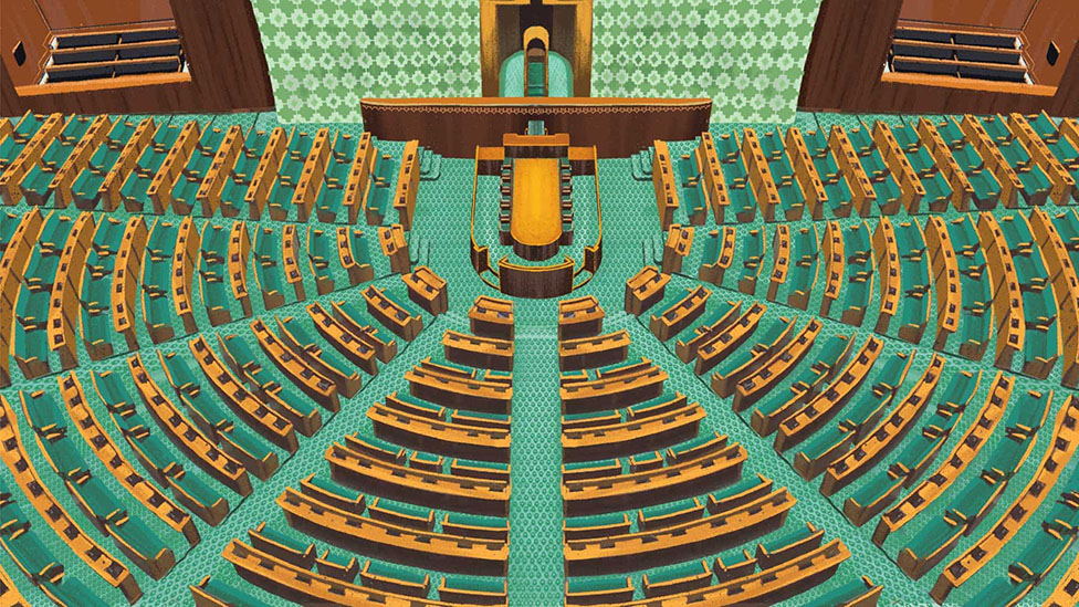
Image shows an illustration of parliament of India from inside
Built an interactive data visualisation explaining parliamentary seat distribution and the impact of delimitation, using SVG and GSAP. A grid of rectangles represents seats and transforms into state-wise layouts through smooth animation, efficient DOM transformations, and performance optimisation, making complex electoral data intuitive and engaging across devices.
  • gsap
  • scrolltrigger
  • Delimitation
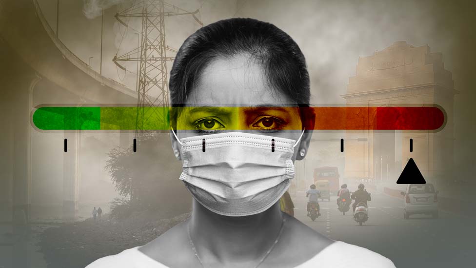
A person with mask and in background is pollution
Award-winning data visualization (Best Data Visualization, WAN INFRA 2025). Built an interactive visualization analyzing 11 years of air quality data across Indian cities using GSAP-powered animations and real-time API integration. Hundreds of SVG rectangles dynamically transform into bar charts revealing long-term PM2.5 trends, while an interactive hero carousel enables seamless exploration across multiple cities with hourly updates from IQAir's API. This project demonstrates how animation, real-time data, and intuitive interaction design transform environmental data into engaging, accessible storytelling.
  • gsap
  • scrolltrigger
  • IQAir API
  • air quality
  • real time data
  • award-winning
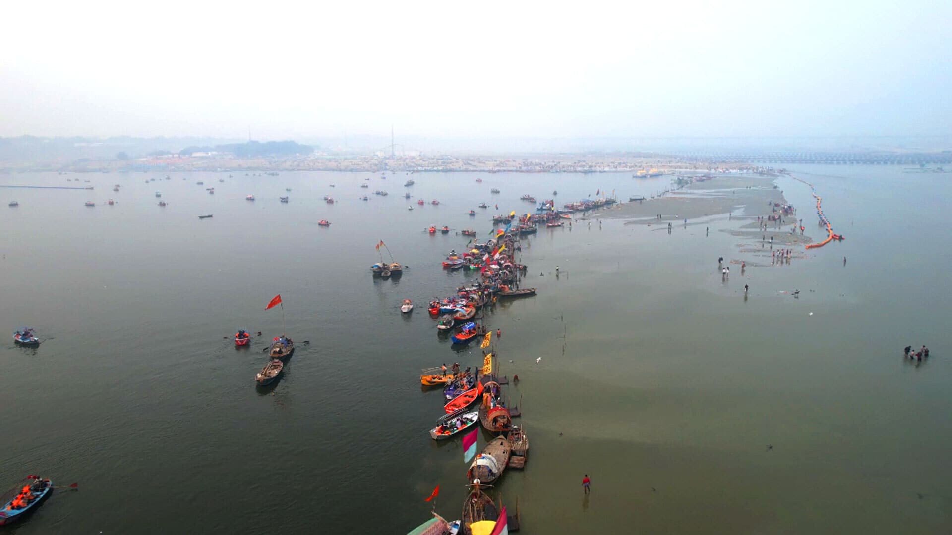
Drone footage of Kumbh Mela ground.
This visual explainer on Maha Kumbh Mela uses scrollamation with SVGs to illustrate the world’s largest human gathering, where millions take a holy dip at the confluence of three sacred rivers in Prayagraj, India. It was published in 7 languages.
  • html
  • css
  • scrolltrigger
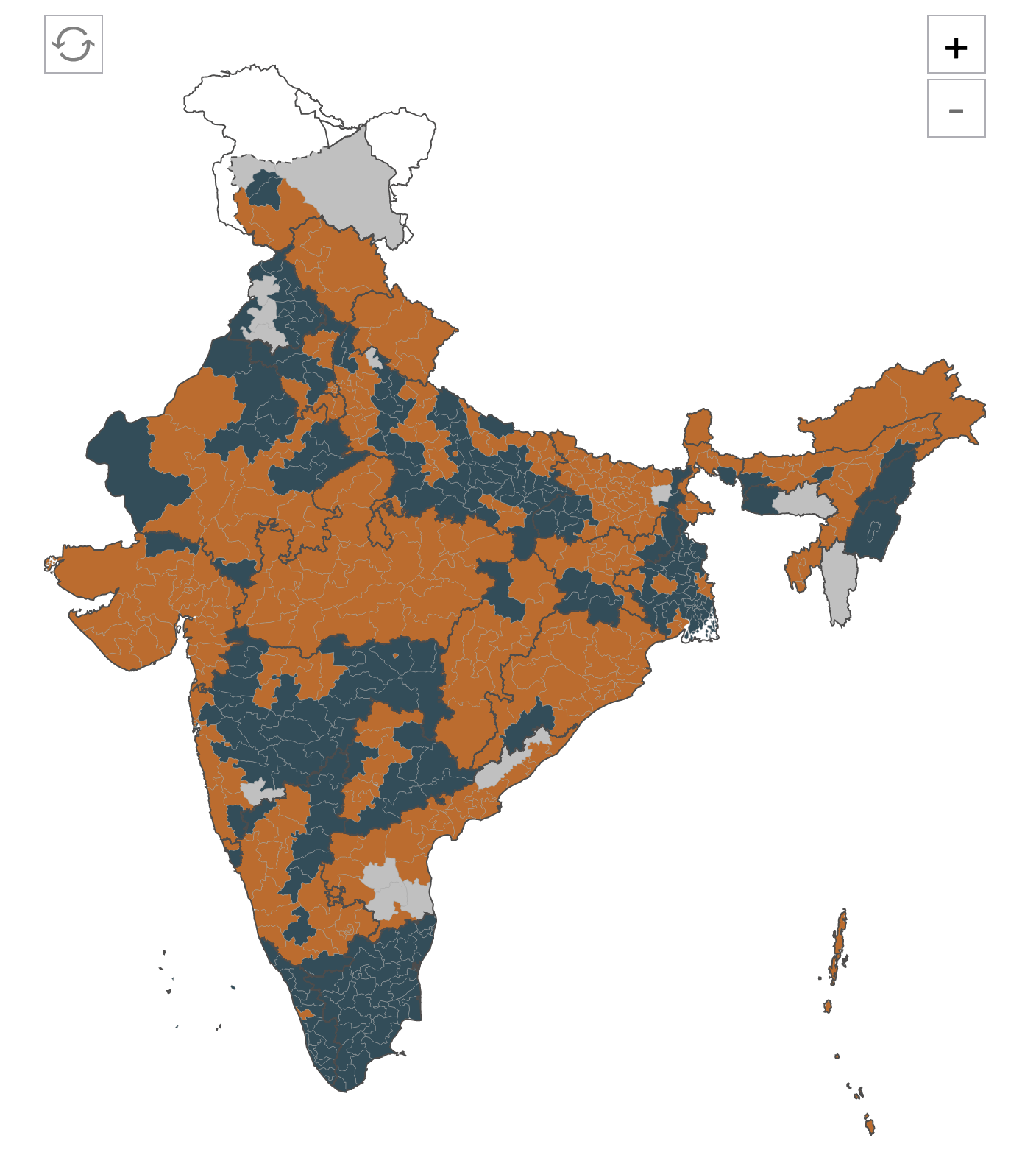
Madhya Pradesh Vidhan Sabha elections 2023
Live Election Coverage
Led frontend development for comprehensive live election coverage platforms across South Asia, serving 40+ million users during peak traffic with zero downtime. Recent projects include: Each project required building robust, performant frontends capable of handling massive traffic spikes, integrating real-time data pipelines, and ensuring accessibility across diverse audiences and devices. My work focused on creating intuitive interfaces that make electoral data transparent and engaging for millions of voters across multiple languages and regions.
  • html
  • css
  • d3
  • Maplibre
  • live data
  • real-time
  • election coverage
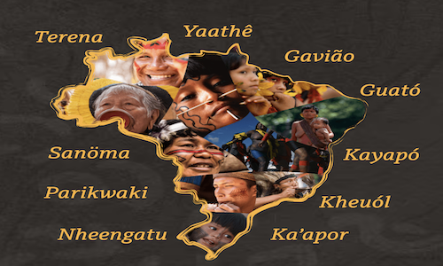
Indigenous Languages of Brazil
This article was published in portuguese where it talks about the diversity of native languages spoken in Brasil by using clustered bubble charts, audios, maps and, graphics.
  • html
  • css
  • d3
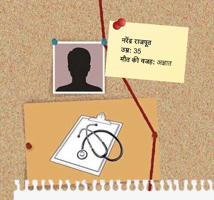
Vyapam: The suspected deaths linked to India exam scam
An investigative article about India's largest scam centered on Madhya Pradesh's Vyapam creatively put together by css art and particle animation.
  • html
  • css
  • particle
  • js
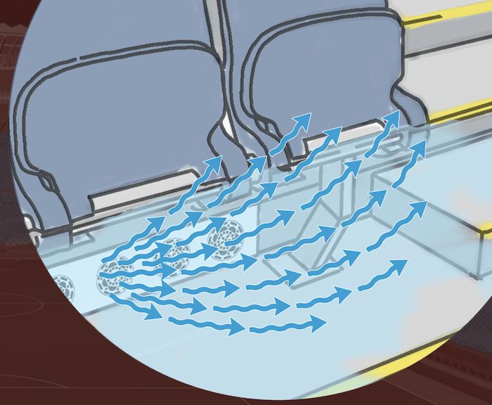
World Cup: Ways to keep stadium cool
Understanding the science behind keeping the football stadium cool in Qatar which hosted the 2022 FIFA World Cup. This article was published in 30 languages.
  • html
  • css

Other noteworthy projects